WORK FROM ROAM
Work From Roam is a concept application designed for the busy individual looking for a spot, outside of their normal space, to do work. This app would allow people to explore new spaces and to find the spaces based on their needs such as WiFi quality, seating, and noise level.
In this project I worked with 2 designers to discover pain points that people had when looking for a space to do work. My primary role in this project was designing the onboarding flow for new users and the pin details.
Role: Research, UI/UX
Toolkit: Figma
How can people find the best WFH spot?
Remote work surrounds us, but how are people looking for places to work from home? Our team realized that people preferred to work outside of their home or living space, and they would seek places like cafes, or anywhere with decent space and wifi. The challenge that we saw and experienced ourselves, was having to find a location that suits our individual needs. People needed a reliable source to identify the best spot for them.
DISCOVERY: People need space and internet
A survey was conducted to collect quantitative feedback on what things people look for the most when considering a remote location to do work. We also used this survey to identify a target user base: un/employed individuals and college students in city or suburban areas.
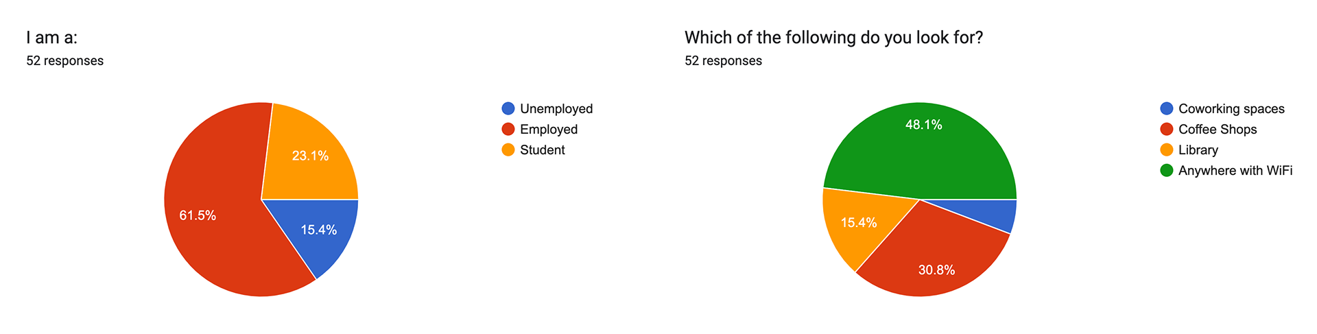
Within the survey we also uncovered important amenities and considerations when looking for a space to do work.
1. Important amenities included WiFi, power outlets, and food
2. People consider the atmosphere and environment of the space
3. People want to have enough space to do work
2. People consider the atmosphere and environment of the space
3. People want to have enough space to do work
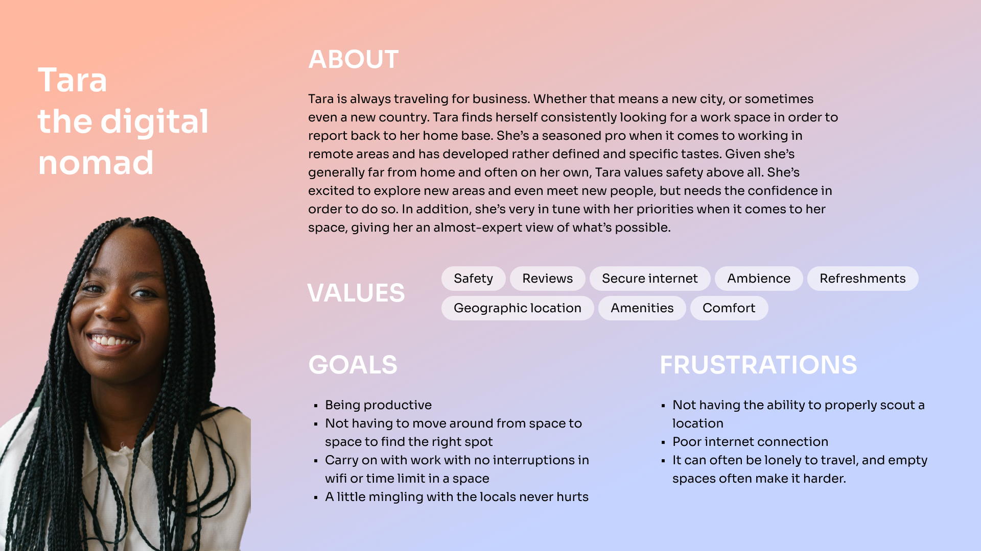
TARGET USER: The traveling professional
I constructed a user persona based on our research to allow the team and me to visualize and empathize with one of our target users, a traveling professional. I shared this with our engineers as well to inform them on how we will be designing this product keeping this type of user in mind. By doing so, I encouraged them to also keep this user in mind when defining solutions.
IDEATION
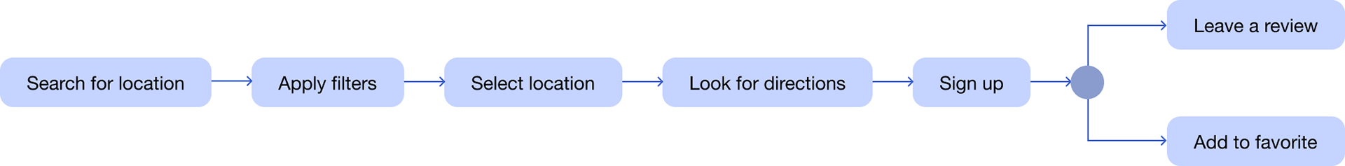
We understood how people could use a tool to search for a location, but we knew we needed a way to keep people using it (so the app could stay alive!).
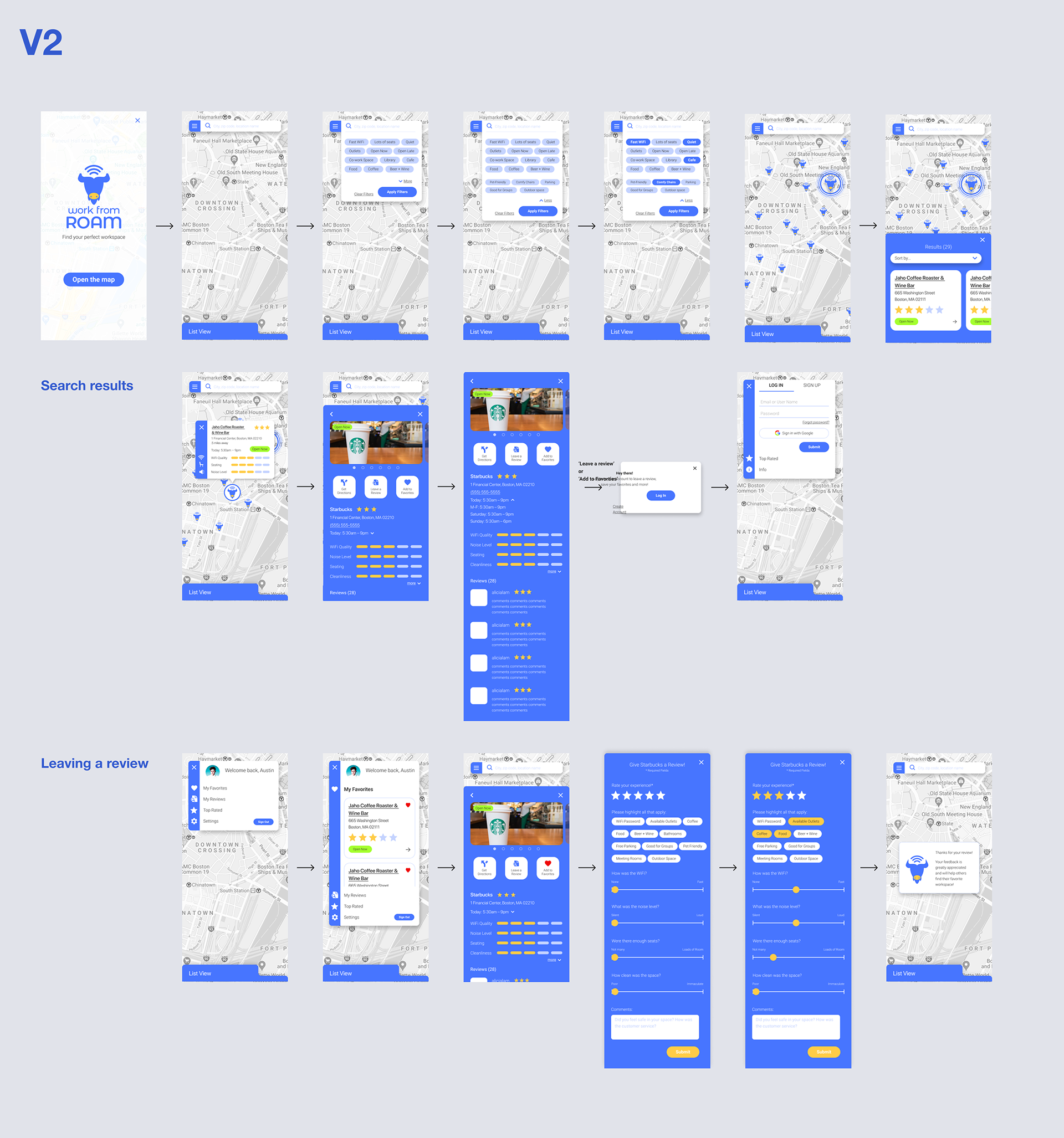
DESIGN PROCESS
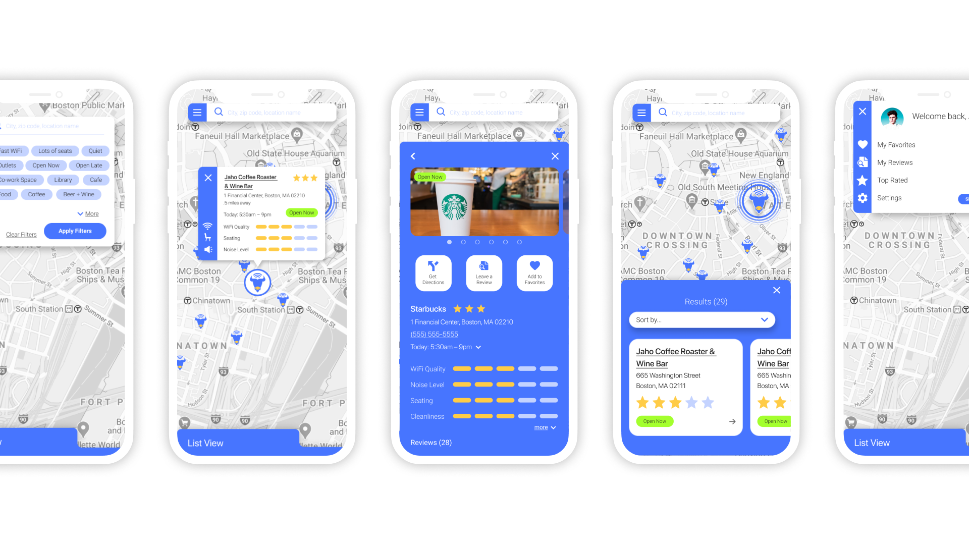
My team and I began brainstorming ideas through an exercise of rapid sketching, which allowed us to visualize possible solutions to begin wire-framing. Our main concern was how can we display the most useful information without overloading information to the user? I often referenced Yelp and Apple maps to analyze how information is displayed to the user without cognitive overload.
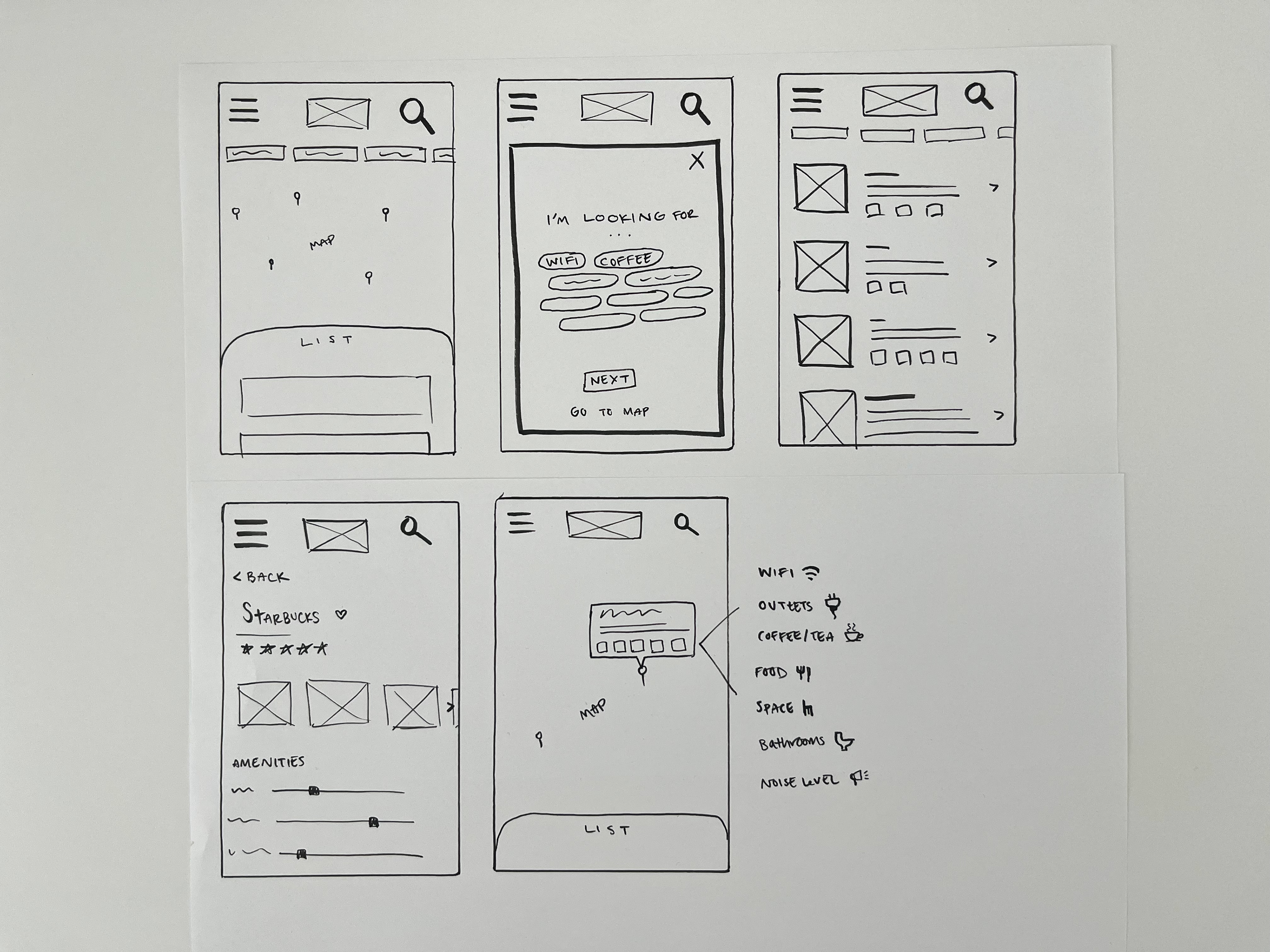
DIGITAL WIREFRAMES
We took our sketches into Figma and began designing wireframes.
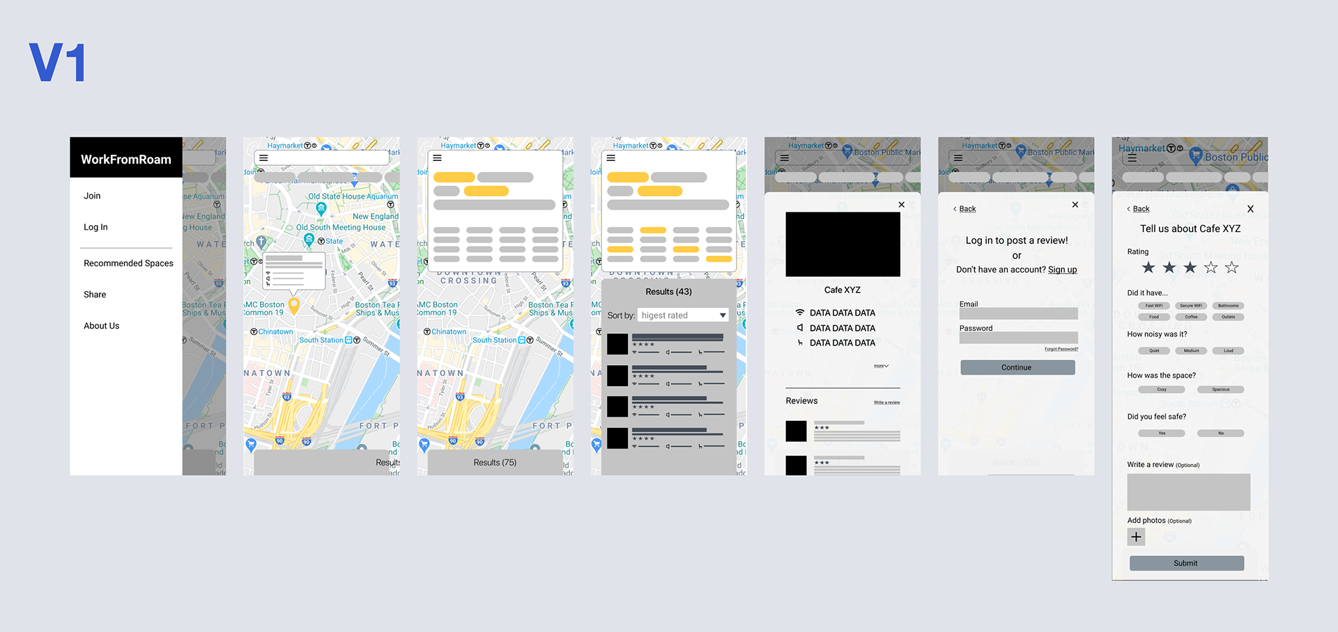
FEEDBACK & USABILITY TESTING
The team and I worked with our developers towards a working prototype using Google maps API and conducted some usability tests. We collected overall thoughts and critique of the application from UX professionals and target users.
People expected a little more upon entering the application. Through my research in the UX industry, landing pages are sometimes overlooked and can be a lost opportunity. I redesigned a more informative and welcoming experience for users by incorporating a series of cards that introduced the app and key features.
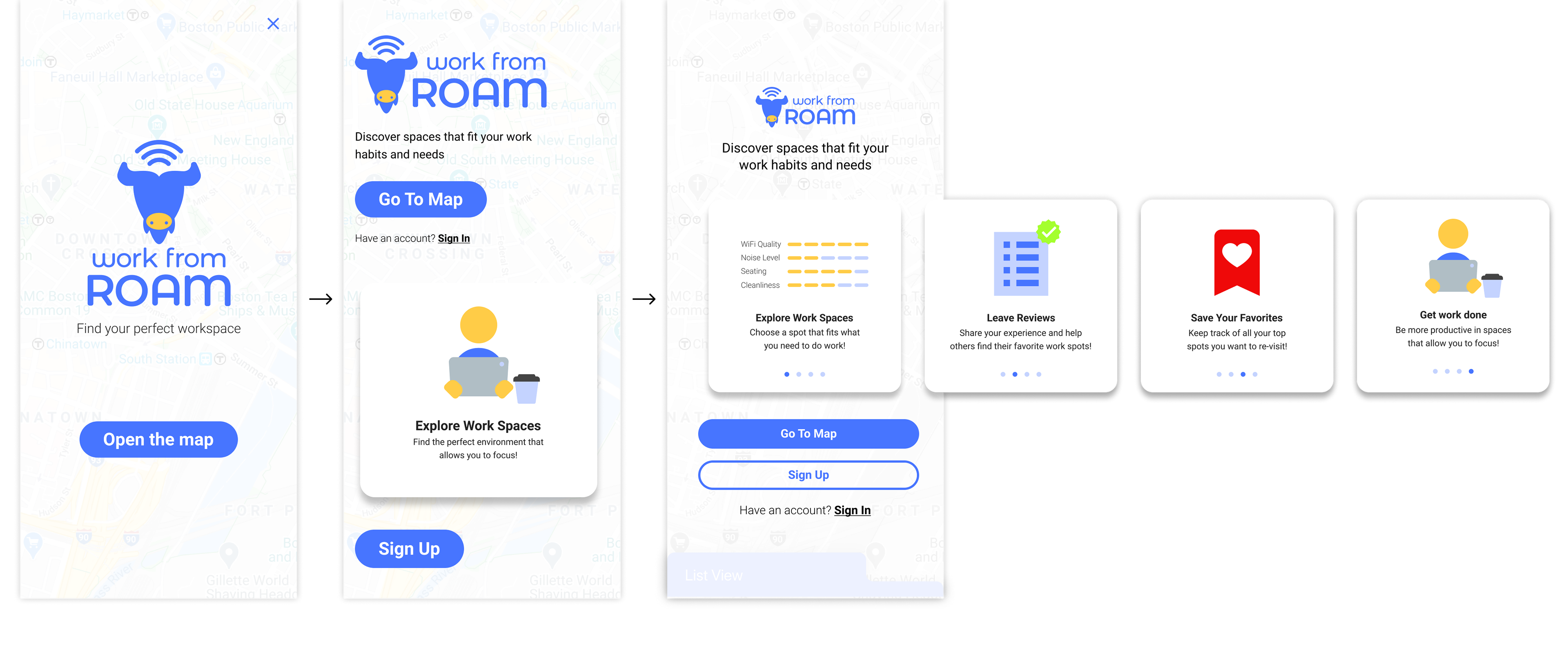
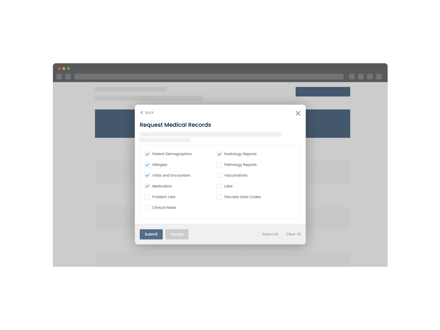
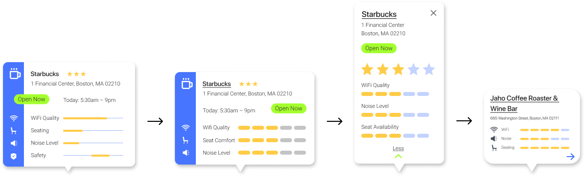
People found that the card information was confusing to follow. They weren’t sure what was considered good or bad on the visual scale we provided for the amenities. I took this opportunity to reorganize the information on these cards and iterated a few times to get the final design. With each iteration I found that...
1. Users were unsure about what safety meant and it was interpreted in different ways so we decided to remove it and add a tag to the comments
2. Users were confused about the organization of the 2nd pin. The amenities rating changed to reflect the 5 point scale that users would rate each amenity on the review page.
3. Users felt that the pin was very large and could not click on other areas of the map unless they closed this pin.
4. Users found this pin to be straight to the point and the rating spoke for the spot. It was intuitive that they can get more info from the arrow.
TAKEAWAYS
This project was an outcome of trying to survive the pandemic. A group of UX designers and software engineers were looking for an opportunity to flex our new skills, and we were able to do that in this project and learn how to collaborate and work with each other in a remote environment. I was able to gather valuable insights from UX professionals as well which helped me reconsider UX/UI best practices for accessibility and designing for different devices.